What to consider for your logo when your name is your company name.

When it comes to personal branding, using your name as your logo can be a powerful choice. It is simple, straightforward and it puts you at the forefront of your brand. Lets look at some tips for creating a logo using your name.

  1. Consider the style of your name
    The first step in designing a logo using your name is to consider the style of your name. Is it long and flowing, or short and sharp? Is it written in cursive, or in a bold, blocky font? Your name’s style will play a big role in determining the overall look and feel of your logo.
  2. Choose a font that suits you
    Once you’ve considered the style of your name, it’s time to choose a font that suits you. There are countless font options out there, from elegant scripts to modern sans-serifs. Think about the personality you want to convey and choose a font that reflects that. It’s also important to consider legibility – your logo should be easy to read at a glance.
  3. Play with color
    Color is a powerful tool in logo design. It can evoke emotions, communicate meaning, and help your logo stand out. When choosing colors for your name-based logo, think about the feelings you want to convey. Do you want to come across as professional and serious? Consider using muted, sophisticated colors like navy or charcoal. Or maybe you want to convey energy and excitement? Bright, bold colors like red or orange could be a good choice.
  4. Keep it simple or (KISS – Keep it simple stupid a throwback to college design class)
    Remember, the point of a logo is to be easily recognizable and memorable. Keep your design simple and avoid clutter. Too many colors, fonts, or graphics can make your logo look busy and confusing. Stick to a few key elements that represent you and your personal brand.
  5. Consider variations
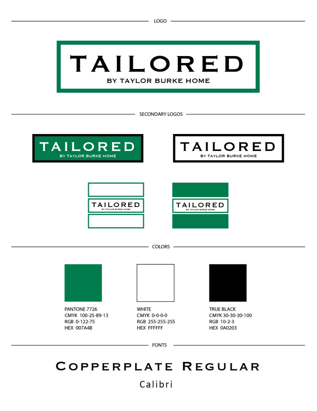
    Finally, think about how your name-based logo will look in different formats. Will it work as a social media profile picture? How will it look on a business card or website header? Consider creating a few variations of your logo that can be used in different contexts. In the logo below, I used an option with initials. If that fits your design – that works as well!

A logo using your name can be a great choice for building your personal brand. If you follow these tips, stay true to who you are and what you want your logo to share, you can create a logo that is unique, memorable, and reflective of you and your personal brand.

Mandi

Posted in design, Inspiration | Leave a comment

2023 Graphic Design Trends

Graphic design is an ever-evolving field and 2023 is no exception. Here are some of the trends to watch for this year:

  1. 3D graphics and animations – 3D graphics and animations are becoming increasingly popular in graphic design and are expected to continue to grow in popularity this year. They bring a sense of realism and depth to designs and can be used in a variety of applications, from logos or websites to product packaging.

2. Bold and bright colors – Bold, bright colors are becoming increasingly popular in graphic design, as designers look for ways to make designs stand out and grab the attention of their audience. Expect to see a lot of vibrant reds, yellows, and blues this year.

If you want to experiment with this but do not have these colors in your brand, try using them with photos or special event designs. An easy way to include it in your design is to use your color as a background and use white for your text! I never suggestion following a trend over staying true to your brand.

3. Hand-drawn elements – If you have followed my work for any time, you know that hand-drawn elements are some of my favorite. Hand-drawn elements are making a comeback in graphic design, as designers look for ways to bring a personal touch to their designs. Hand-drawn illustrations, typography, and other elements can add a unique and human touch to designs, making them more appealing and memorable.

4, Abstract shapes – Abstract shapes and forms are becoming increasingly popular in graphic design, as designers look for ways to create designs that are unique and eye-catching. Expect to see a lot of abstract shapes and forms used in logos, backgrounds, and other design elements this year.

These are just a few of the trends to watch for in 2023. As always, the most important thing is to choose design elements that are appropriate for your audience and that help to communicate your message effectively.

Want to know how to use these with your business? Send me an email and we will come up with a great solution!

Posted in design | Tagged , , , | Leave a comment

What you need to know before painting a mural on your building.

With the rise in murals around the area, I have recently been asked to do the design for two in our area. One is for Barnhardt Jewelers on the side of their recently renovated brick building and the for Nest Homes on the side of large barn.

With both of the designs, a lot of thought went into the what to the design process.

Here are Five things to consider when planning your mural.

  • Consider the location. Are you choosing the best place for your mural? What is the foot traffic or drive by traffic and are you using the best place possible. Also it is important to consider your audience – who will see it most regularly.
  • Consider the size. Often times this will depend greatly on your paintable space and/or the space you are allowed by obtaining a permit from a city council.
  • Consider what you will need to do. If you are in city limits or on town walls and/or the exterior of buildings, you will need to get a permit which may include: allowing you to paint or apply a print, the size you are allowed to do and the location. You may also want to consider hiring a muralist or a printer depending on how you plan to apply the mural.
  • Consider the medium. .This is important, especially when working on an exterior mural that is subject to the elements. Hire an experienced painter that specializes in murals or work with a printer that can apply a heat applied material to your space.  
  • What are you trying to say? On both of the murals I worked on, we were trying to quickly show a message and support the business so we knew 2 things: we needed the logo very present and we needed the words to be large and easy to read.

With Nest Homes we wanted a simple message of supporting local farms and farmers. The design went back and forth on adding animal silhouettes but ultimately we kept the design simple – I think it turned out great! Nest Homes used The Barn Artist who has completed multiple barn murals across the country. He did an amazing job!

May be an image of outdoors and text that says 'Û nest WE SUPPORT OUR HOMES LOCAL FARMS ★** *'

The mural for Barnhardt Jewelers was very different, located in a historical downtown setting.

This mural quickly showed the newly updated logo and also was telling the town of the stores new location as well as a quick glance into what the store does.

Being in the city limits, the design was limited to a very specific size and as it was printed on exterior brick permits had to be pulled with the city.

It’s no secret: murals make our neighbourhoods beautiful! They add color to building walls and streets that would otherwise go unnoticed, which is a treat for locals and tourists alike. Murals attract new local businesses, help bring customers to pre-existing locations, and boost the economy of an area.

They have the opportunity to tell the business’ story, create a unique experience, engage citizens, increase foot traffic and tourism, increase appreciation for the arts and artists, and increase overall attractiveness of the space.

Please share your favorite murals! Comment here or tag me at @dryinkdesigns on Social Media.

Posted in design | Tagged , , , , , , | Leave a comment

5 things every mobile website should have.

It is time. Time we stop making the mobile version of our website boring. Time to stop letting them be an afterthought of the desktop website.  Face the facts… over half of the time someone views your website it will be on a mobile or tablet device. 40% of people ONLY use their phone to search website.

IMG_5788

All sites should be RESPONSIVE. Responsive design basically means that your design will be created in a way that it can be viewed on many platforms… mobile devices, tablets and of course desktop computers.  If your site is not currently responsive, let’s work on that!

  1. Always have your logo visible and have your visual brand present.
    • Creating a lasting visual impression is such a big deal and you will want to make sure that your log is front and center!  Consistency is KEY here and you want to make sure everyone knows exactly who they are looking at.  I always suggest having your logo and your colors visually present.  This can be done with text, photography or graphic elements, but it sets the tone and keeps visitors on your site longer – (SEO people!)
  2. Make it super easy to find the menu – some people call that stack of three lines the hamburger, but this is KEY if you want people to explore your site.
    • There were years I spent trying to over design my sites… trying to make the menu so cool that people would want to just sit and mess around with the navigation.  Well, those days are long gone.  You get about 5-10 seconds for people to easily navigate to the page they are looking for, or sorry – they are moving on to the next.
  3. Have your social media easily accessible!
    • Simple… have it up top, have it down bottom… Social Media is the new business card and people will follow you and “keep your information” with your social media profiles.  There are ones I suggest for various reasons, but that is a topic for another day.  Must haves – FB and IG!
  4. Have a way for people to contact you. After all, this is the main reason we want people to come to our site… to be able to contact us!
    • As much as you would like to think people are reading your entire site… they aren’t!  They are looking at your home page, maybe a portfolio, possibly your about page.  They aren’t going to search for a way to get in touch with you.  People do not take time any more, and if you do not have an easy way for them to contact you…. they won’t.
  5. Have a call to action.
    • This is a simple graphic that prompts a visitor to take the next step.  A few of my favorites are listed below.
      • Phone number – these should be directly linked so the visitor can do it easily with one touch!
      • “Contact us” page
      • “Follow our blog” or “subscribe to our newsletter”
      • “Download a free guide”
      • “Follow us on social media”

IMG_5786

Do not let your site be dull. It should be interactive, clean and large enough to read, branded (with more than your logo) and simple to navigate!

Questions?? I’m here to help!  Contact me to day!

Mandi

responsive design.jpg

Posted in design | Tagged , , , , , , , | Leave a comment

Speak for yourself

I have had my business now for just over six years.  I have grown this business to a place of comfort.  I have done MY design, MY way and served clients on visual branding, website design and marketing.

I read a quote today by MLK that says, “You must decide to speak for yourself; nobody else can speak for you.”  Today it rings clear. For years now I have received questions from clients making sure that I was the one doing the design.  I have had people come to me for designs based on drawings that I do just for fun.  People always comment, I always know it is from you because of your handwriting or it is my clean style.  Even at my wedding, my dear florist, Springvine Design, said – you are no longer allowed on Pinterest… You tell me what speaks to you, not what you think others believe to be beautiful.  I ended up with the most amazing wedding that was so true to myself.  So why – why was I pushing myself  to conform to others when all of this talent was in me?

New days are ahead!!!   I have always compared myself to others.  Looked at other designers, followed trends and made sure I was fitting in.  Well now is the time for a shift.  I am giving more of myself these days.  What does that mean?

  • I am following my gut vs comparing my design to others.
  • I will use my years of experience and knowledge, and share that with you.  It may be design tips or what I consider to be a trend – but it will come 100% from me.
  • I will share my art and my passion for design.
  • In hand lettering – I will use my handwriting and my style vs trying to copy what I see as beautiful as I thumb scroll through IG.
  • I will create an email platform for you all to share inspiration and education on graphic design.  I have learned from some of the best through the years and now it is time for me to give back!

With all of this said, Is there anything you would like to hear?  Like to learn?  PLEASE share!  I am here, with my whole creative self for you!

Want to dig deeper and tell your story?  Contact me to get started today with your creative process!!

MLK

Mandi

SaveSave

Posted in Inspiration, Uncategorized | Tagged , , , , , | 3 Comments

Hand lettering Challenge – #letteritjune – Part 2

I will say that participating in the hand lettering challenge by @Jennymaiedae has proven to be very helpful to me and my practice!  I have really enjoyed experimenting with different pens and papers.

A recap of my first half of the month can be seen here.

Now for a few favorites for the end of the month.

Hand Lettering Quote Hand Lettering Quote Hand Lettering Quote

Hand Lettering Quote

Hand Lettered Quote

I hope you like viewing these as much as I like doing them!

mandi

Posted in design | Tagged , , , , , , | Leave a comment

Handlettering Challenge – @letteritjune

I have practiced calligraphy and hand lettering for years, but recently I have put more focus to my practice.  When @Jennymaiedae posted her line up for #letteritjune on Instagram, I knew this was something that I wanted to participate in.  I am about halfway through the month and have really enjoyed how I have pushed myself and tried new styles, techniques and pens.  I have also used a bit of my faux calligraphy, which you can see more on this here.

Below are a few from the first 15 days of this month!  If you do hand lettering I challenge you to join in!  This has really helped me.  Follow along on Instagram or Facebook to see all of my sketches and drawings.

you are so loved don't stumble over something behind you let love grow cheer others on sometimes it ends up differently


mandi

Posted in design | Tagged , , , , , | 1 Comment